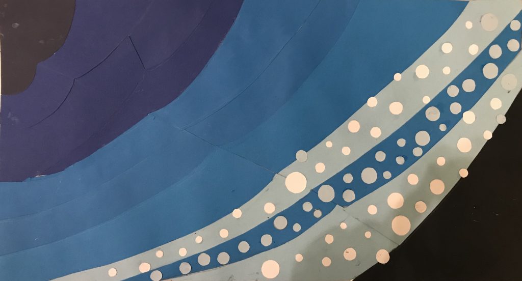
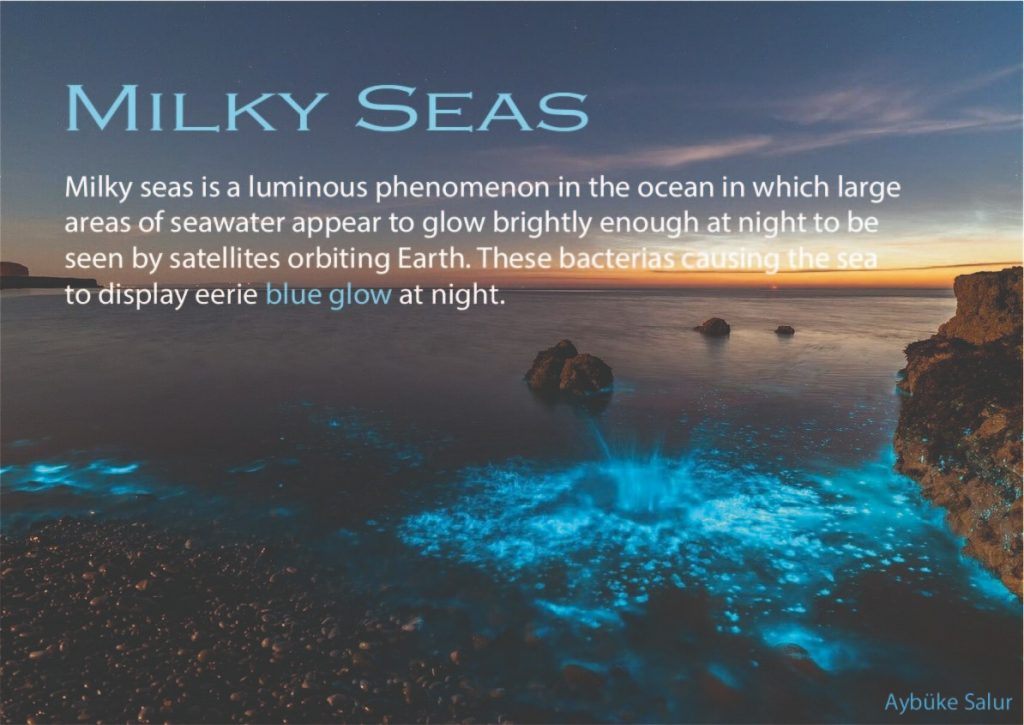
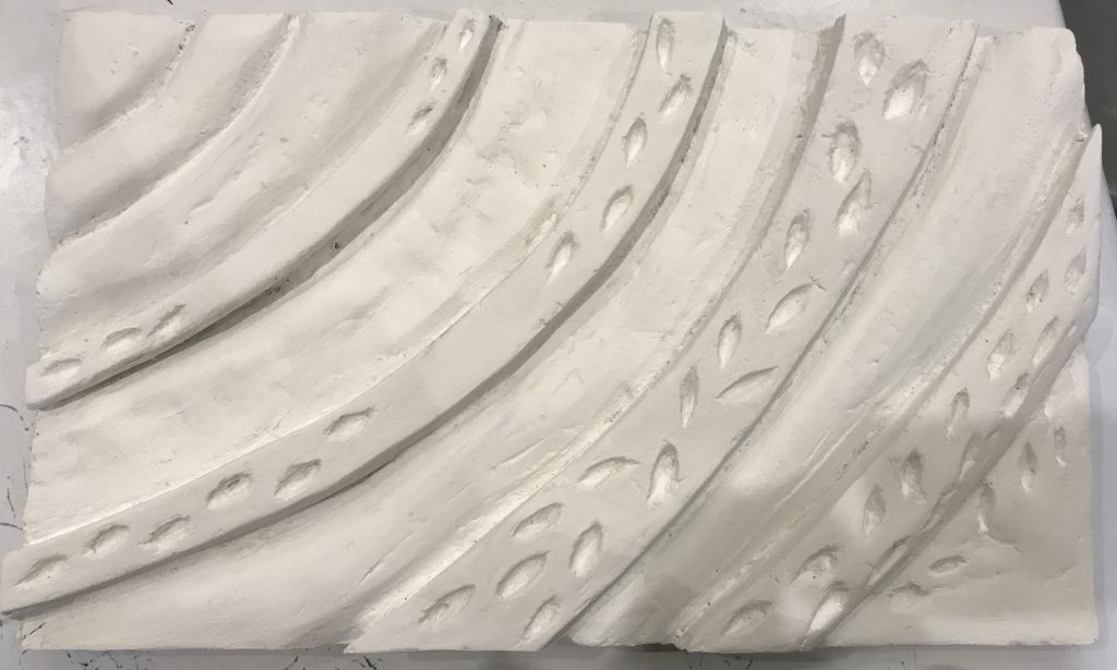
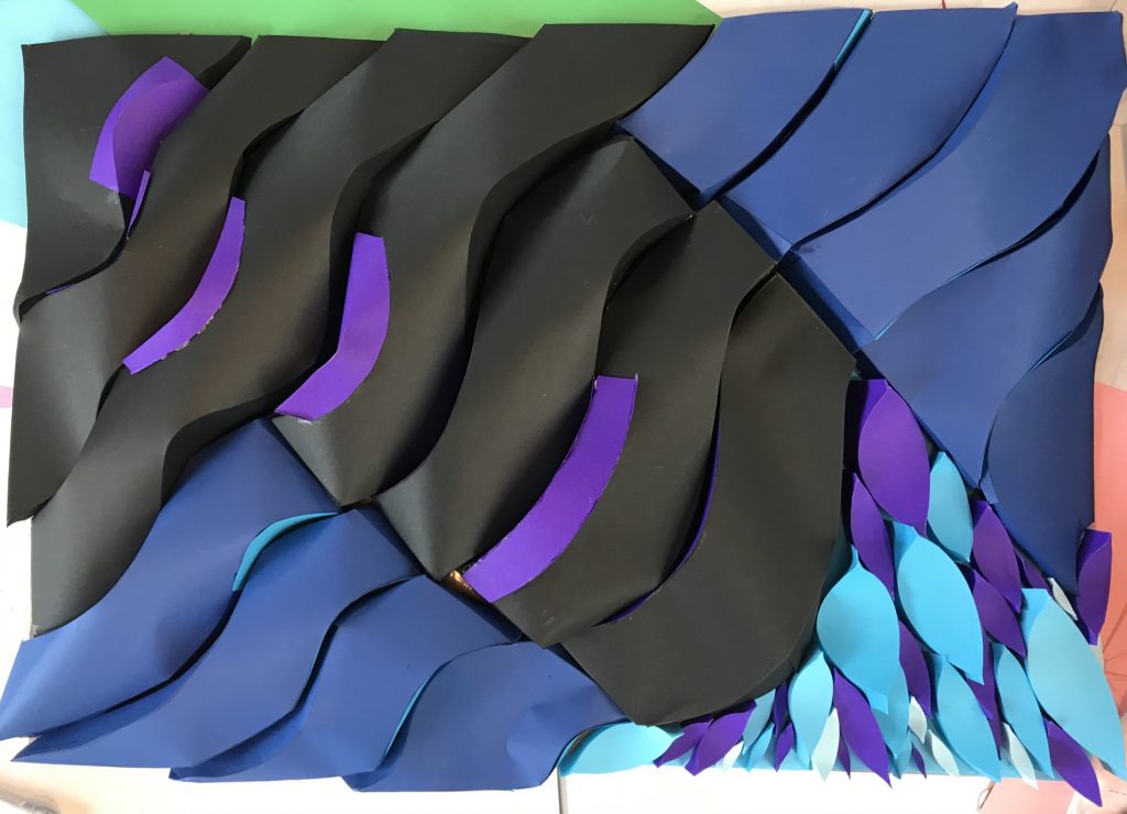
My final project composition’s subject is milky seas effect. While i was making my composition i researched about this topic a lot. I inspired pictures which i found on internet while i was making my project. I used dark colors for my waves due to this phenomena occurs in nights. I used two different colors black and dark blue and i choose purple and turquois for bacterias which causes this glowing effect. …
Author: aybukesalur
Rythm
Relief Design II
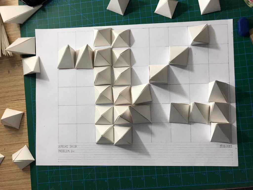
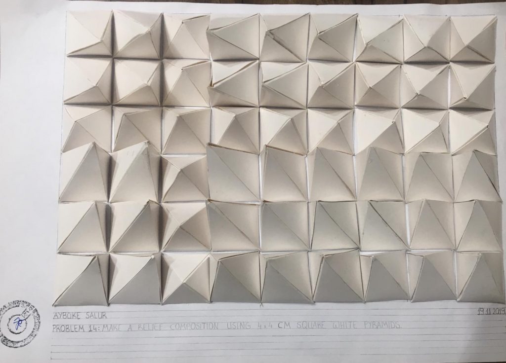
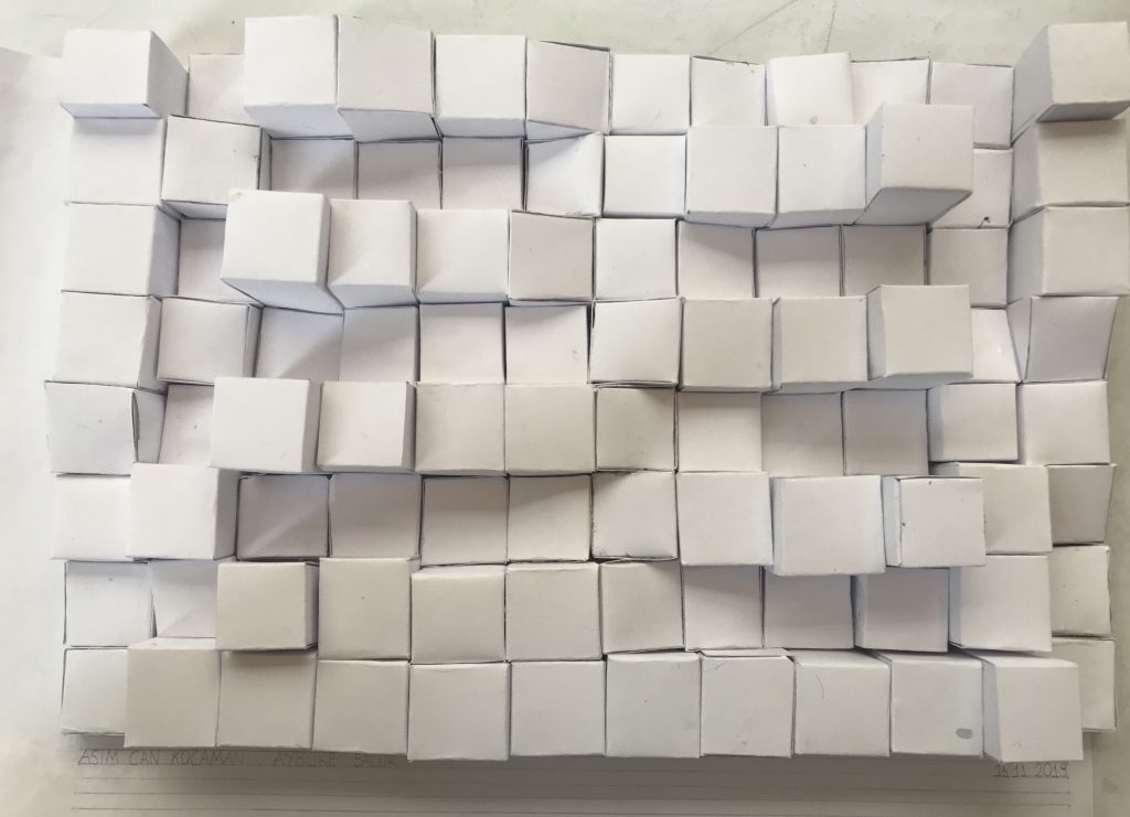
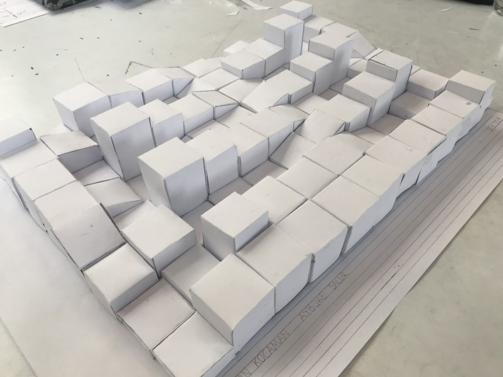
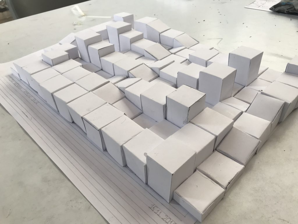
I tried to use both inclined and straight pyramids. Inclined pyramids are placed towards straight ones. The outmost pyramids’ height lowest and it is getting higher close to the straight pyramids.…
Colored Relief
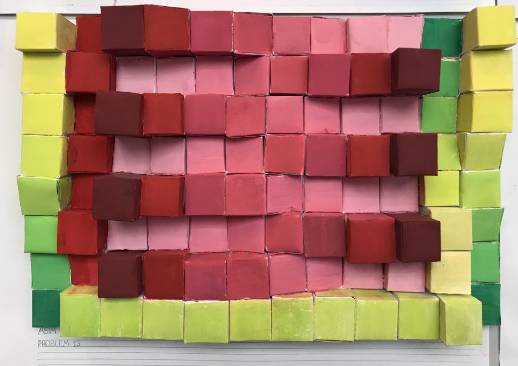
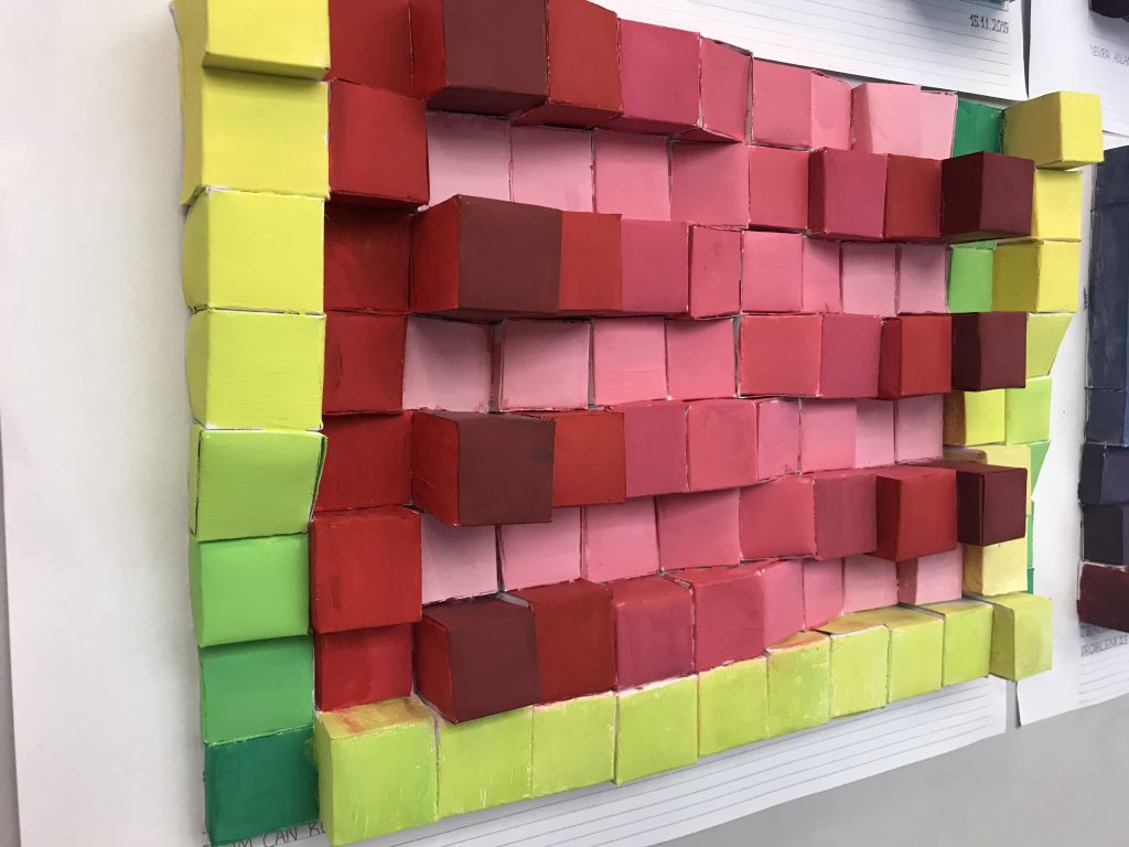
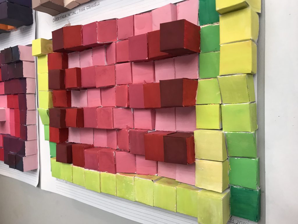
While we are painting our prisms, Asım and I thought like we should use darker colors for highest ones. Then we decided to make colors more lighter each one. …
Relief Design I
In our assignment, we tried to indicate our tetragonal prisms are getting smaller like stairs. Prisms are ordered to accomplish that aim. Then, while we are thinking of corners of our formated paper, we decided to do same stairs but in a different way. So that, it shouldn’t look boring and this contrasting idea will give more dynamism our work.…
Contrast & Transparency
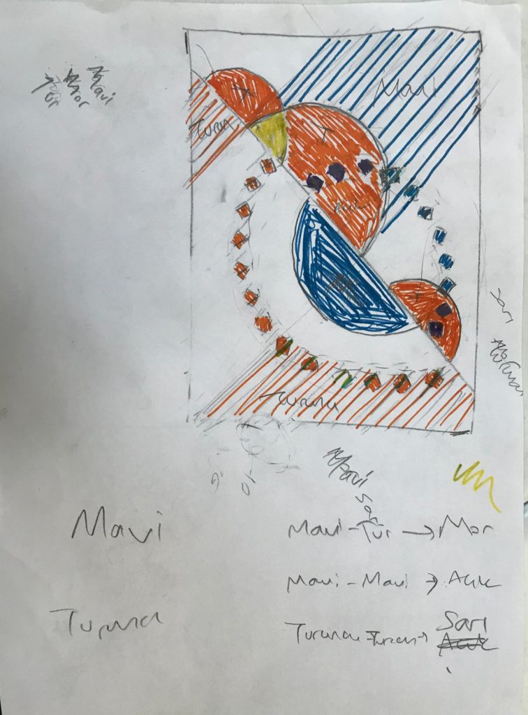
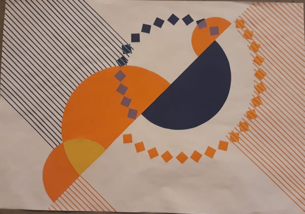
We wanted to indicate contrast by using colors and edges of geometric shapes. We decided to use squares to complete our semi-circles so that we demonstrated a circle line by sharp edges. These circles and squares are moving each other for indicate transparency. We used stripes for not only show transparency but also enrich contrast. Stripes are placed opposing ways and the colors of stripes are connected to whole contrasting idea too. We thought that stripes make our composition more dynamic and effective.…
Relief from Stripes
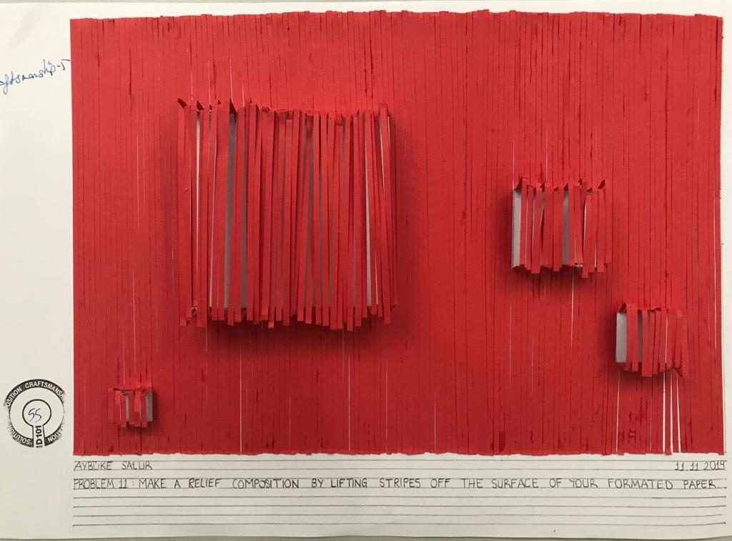
While I was making my composition I had a difficulty in crafting. Also making my squares really high affects my composition. …
Transparency by color
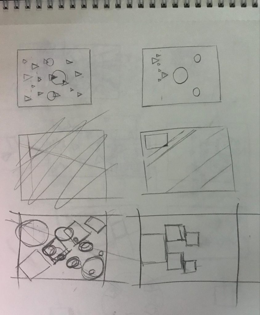
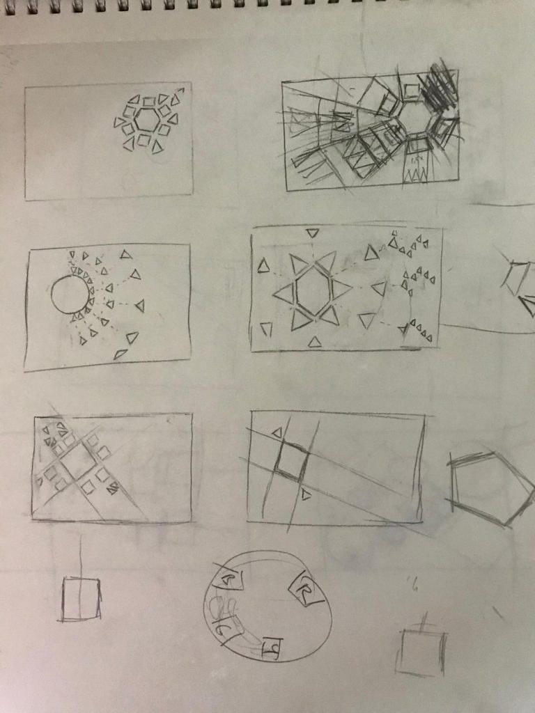
My sketches
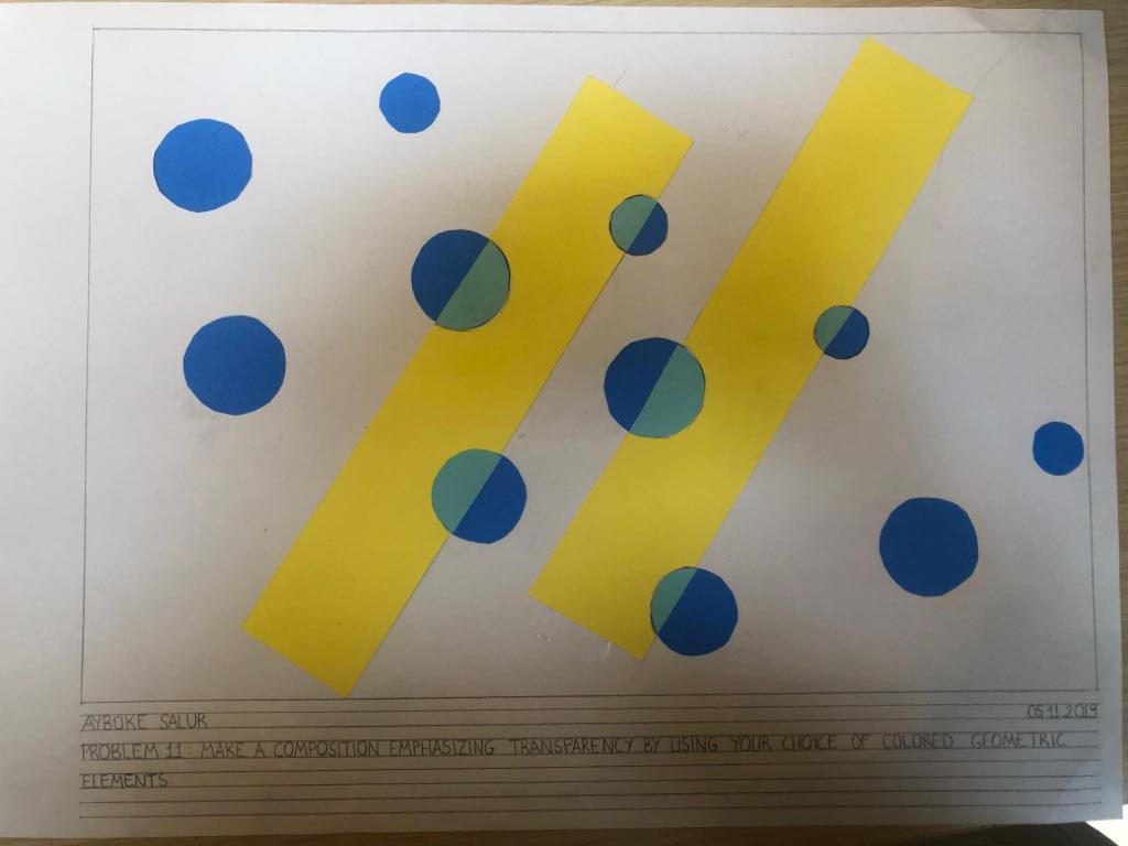
I tried to indicate a transition view by using two different elements. While these elements are moving each other in order they reveal transparency.
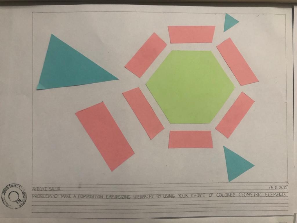
Hierarchy
I wanted to indicate hierarchy by using the distance and size difference between my elements. However, the inability to use my area and my choice of color were affected my assignment badly. I couldn’t manage to transfer my measurements which i planned. The hexagon is the top of my composition and triangles show hierarchy between each other. …

