Song : https://youtu.be/LrEzHQXY3PY Can I call you tonight – Dayglow.
This assignment was a tricky one. The song I chose had 2 parts, the voice of the singer and the music, which I represented with 2 complimentary & contrasting colours, blue and orange. Orange represents the voice and the different shades and forms of the blue elements represent the different notes of music playing. The ground represents a note of music that plays throughout the song. The song also had symmetry and repetition, it starts slow, gradually picks up speed and then it ends slow again, so I tried to incorporate that in my composition too. In addition, whenever the singer would sing, the music would stop which why the the different blue elements don’t converge with the orange ones.…
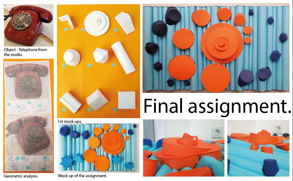
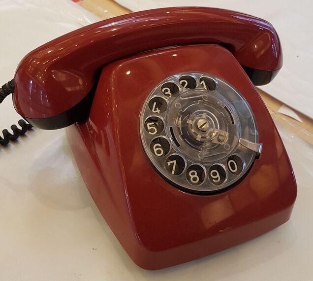
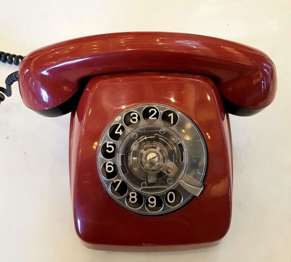
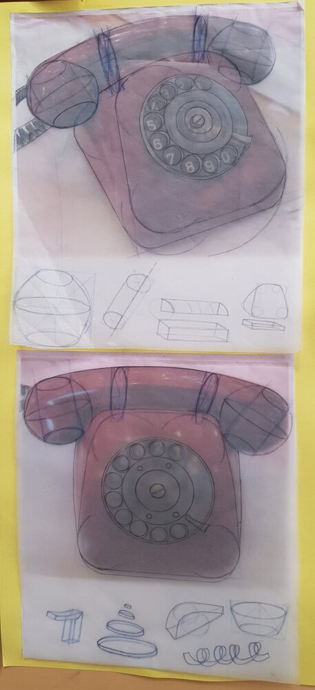
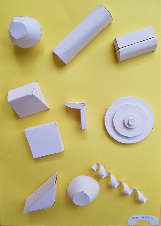
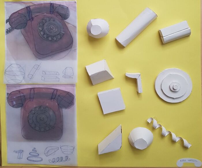
Object – perspective 1 My object was this red telephone that I found in our design studio in the Faculty of Architecture. Object – perspective 2Geometric analysis of the telephone using a dark blue colored pencil and a normal graphite pencil.The mock ups – made using American bristol.Overall assignment.…
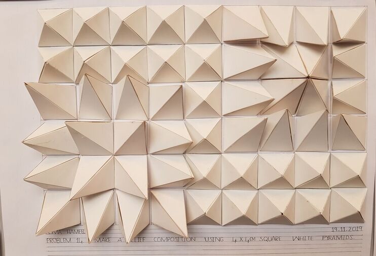
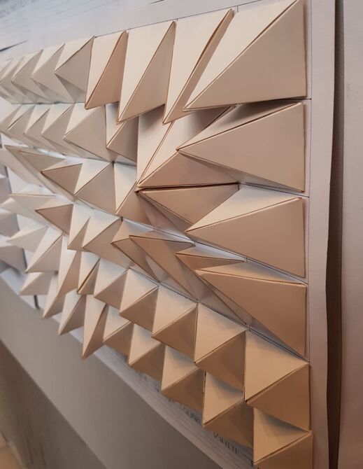
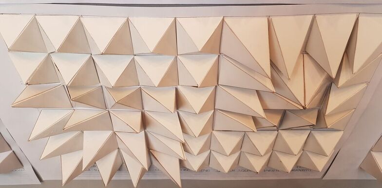
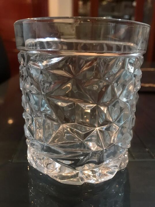
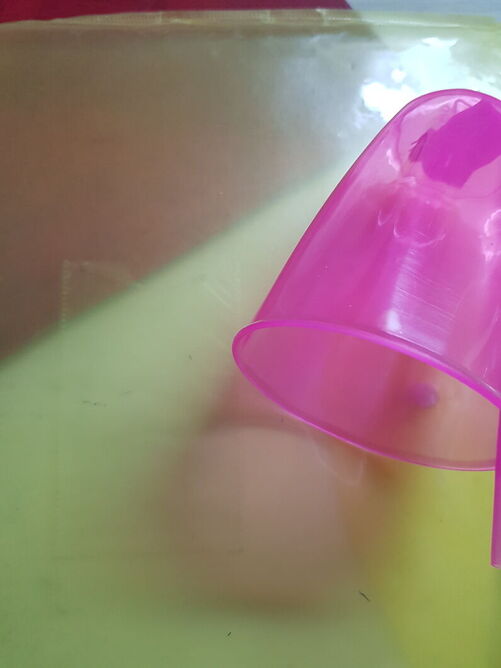
Assignment – Perspective 1 Usually I try to complicate all my ideas for my assignments and I mostly end up regretting my decisions of not choosing my simpler ideas. However, for this assignment I decided to show a simple, easily understandable contrast between two regions. I first generated the nets for my pyramids using the app called ‘GeoGebra’ and then I drew them on ‘Adobe Illustrator’ and finally, I used laser cutting to print and cut them out. I think that it looks very interesting! Assignment – Perspective 2 Assignment – Perspective 3Real life example : A ceramic glass at my home. …
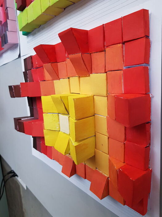
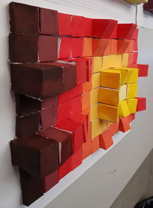
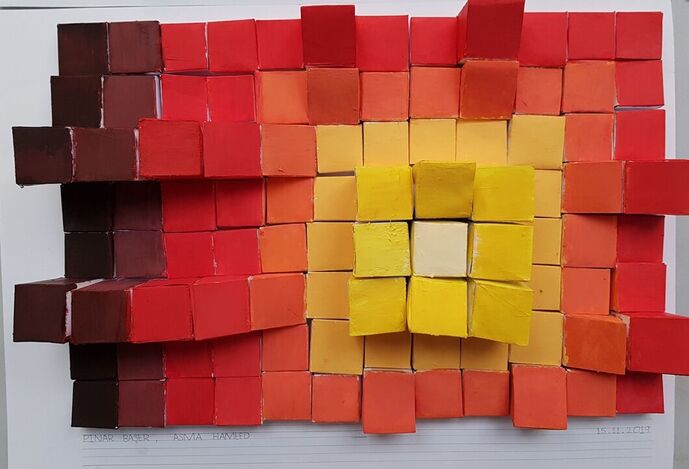
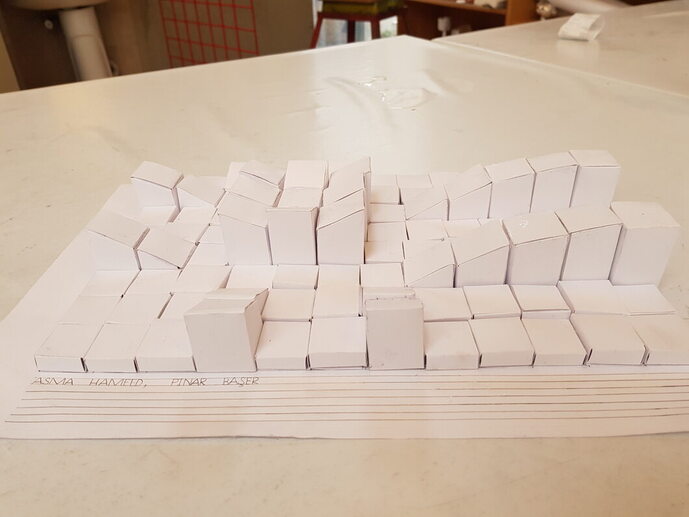
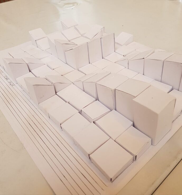
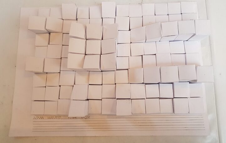
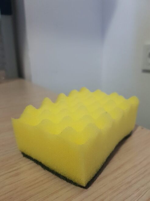
Assignment – perspective 1 Done by : Asma Hameed and Pınar Başer This assignment took us several hours to make. We tried to show dominance in our composition but we realised that it was not such a good idea after we had executed it and we didn’t have time to redo it. Our craftsmanship is not very good but we will try our best to improve next time. We learnt from our mistakes about the relief, such as the abrupt differences in the heights causes a large contrast so the relief design is not well exhibited. Assignment – perspective 2 Assignment – perspective 3Real life example of a relief design – a sponge in my dormitory.…
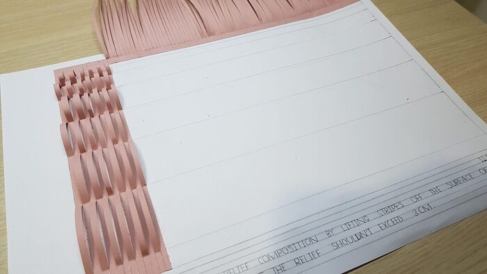
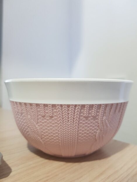
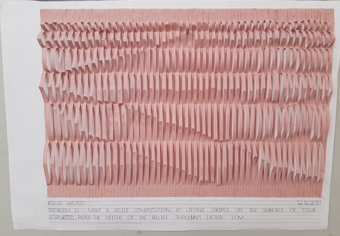
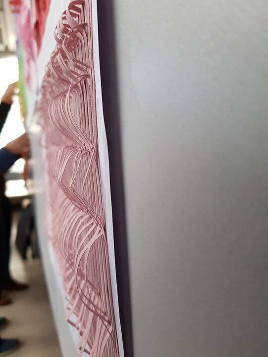
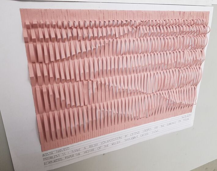
The process of making this assignment was long and tiring as I had to glue each stripe down individually at a particular distance which I first marked with pencil on the formatted paper.Real life example – A bowl in my dormitory.Assignment – perspective 1Assignment – perspective 2 (from the right side)Assignment – perspective 3 (it looks very interesting from this angle)…
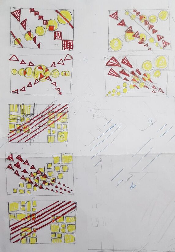
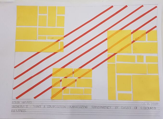
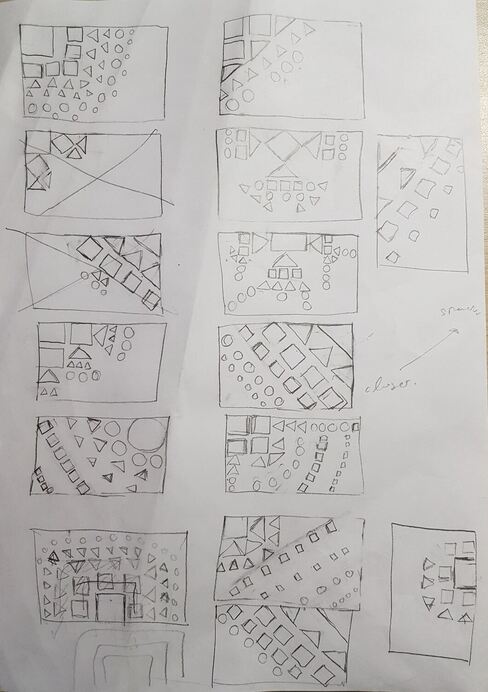
Group 3 – Direction and Transparency. Done by : Asma Hameed , Nevra Aslan , Mete Şerbetçi , Gülşah Şimşek , Tuğba Kuru The triangles are used to indicate the direction from the top left corner to the bottom right corner. The circles are spiralling around the trail of the triangles, exhibiting transparency when they are on top of the triangles. The sizes of the shapes decrease as they go from the top left corner to the bottom right corner. We had a lot of fun while making this project. I think we worked really well as a group and we took everyone’s ideas into consideration.