
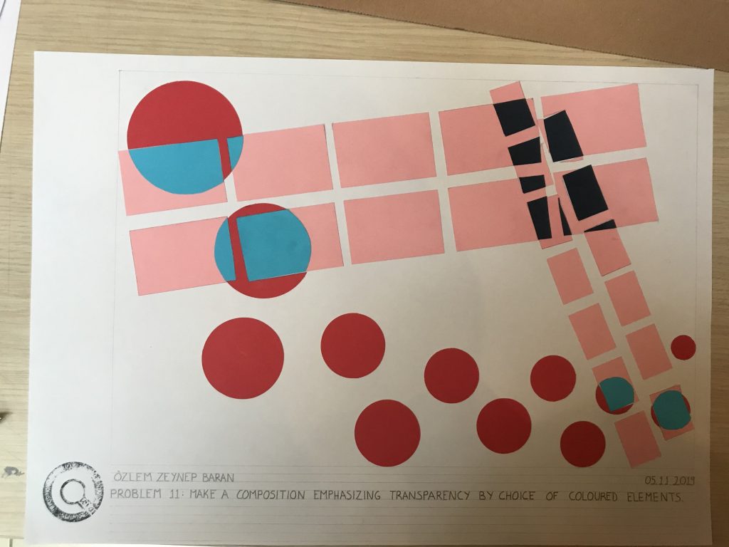
I used pink, red, blue and dark blue in my composition.I wanted to use contrasting colours the make my composition dynamic and further emphasize the transparency. I made my elements get smaller so they would look like they are going into the page to get rid of the 2d effect as much as I can do. I made both pinks and pink – red intersections to show that all my elements are trasparent.