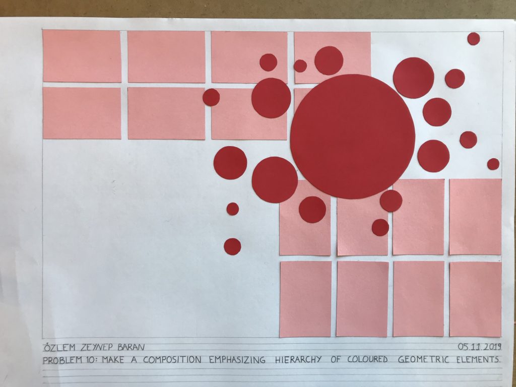
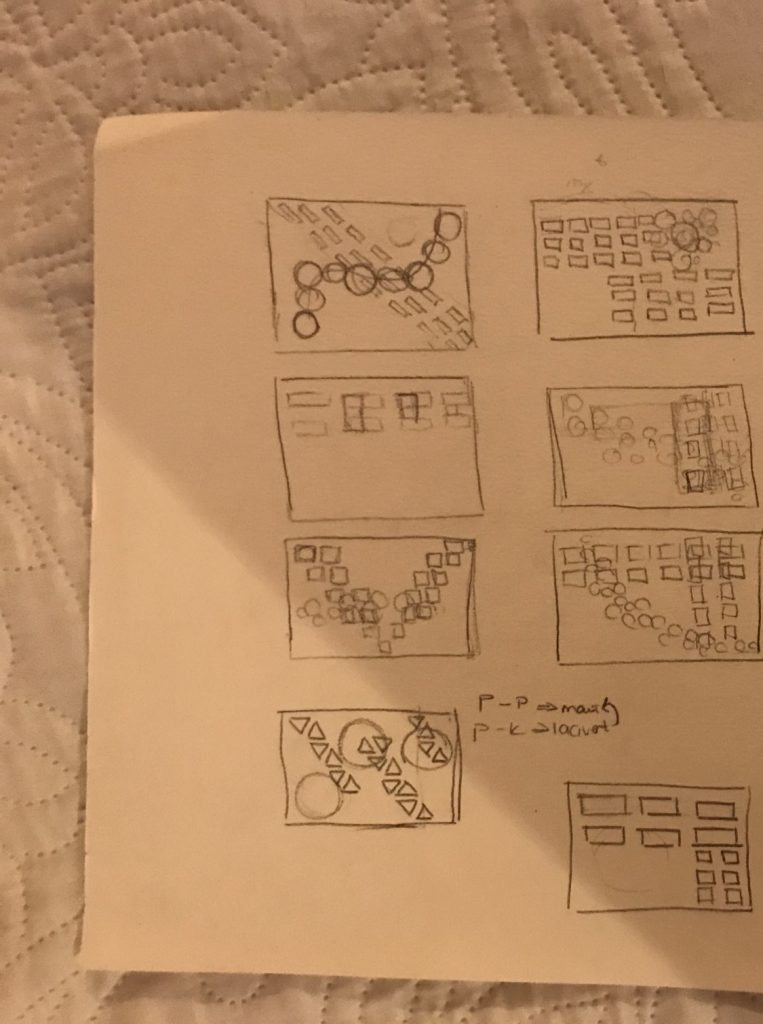
I wanted to use colour, shape and size to emphasize hierarchy in my composition. I used red and pink because they are very close colours to each other yet is so dominant over pink. I made circular shapes with red to give it a more dynamic effect. And I made the circles in different size to emphasize hierarchy in the red colou itself. So the biggest red circle is dominant to the smaller ones and the overall red circles are more dominant to pink ones. I made the pink rectangles face different directions to make my composition more interesting and used the negative space to give it an asymetrical effect.